
Corporate branding collateral for a global, ASX listed property company.
With an exisiting brand guideline developed by external agencies, Goodman’s in-house design team are responsible for the roll-out of a variety of design work like estate signage, brochures, social media posts, corporate policy documents, event collateral and animations which are screened in the flagship office’s “totem” screens.
With a well-established brand guideline, the Goodman design team work cohesively to ensure all final artwork is strongly tied to the brand while also being functional for the property management, property development, finance and law teams’ design briefs.

I re-designed a suite of company policies using updated brand colours and new imagery. This involved sailing with both marketing and law teams within Goodman to ensure the final product met their design brief.
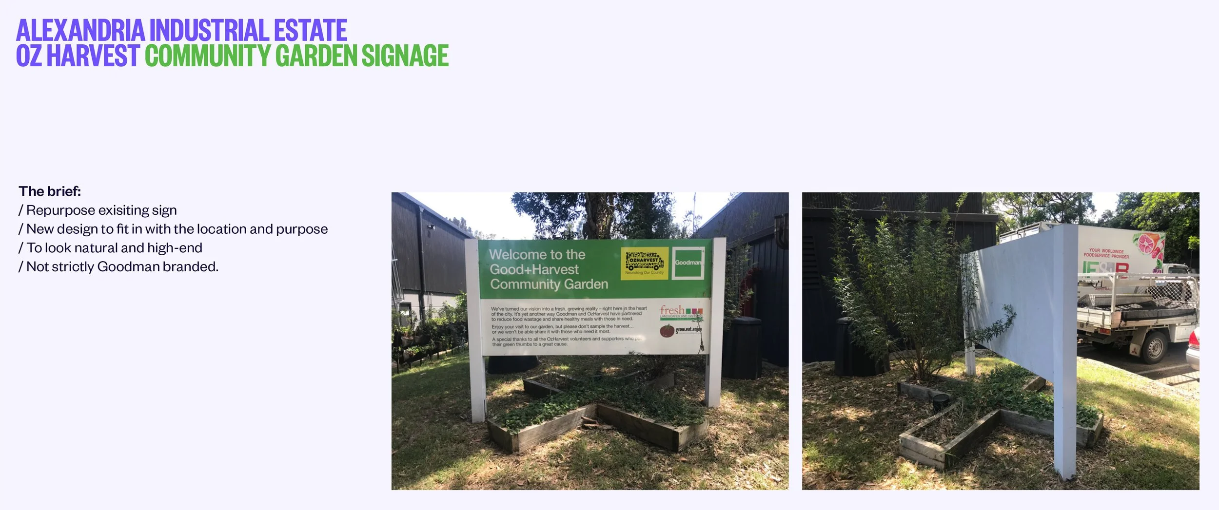
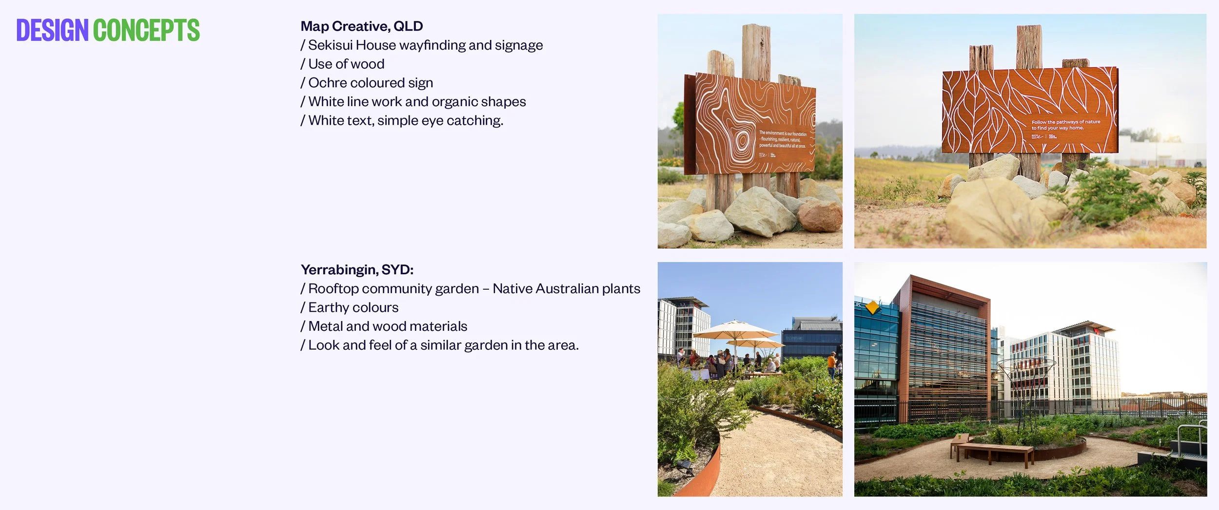
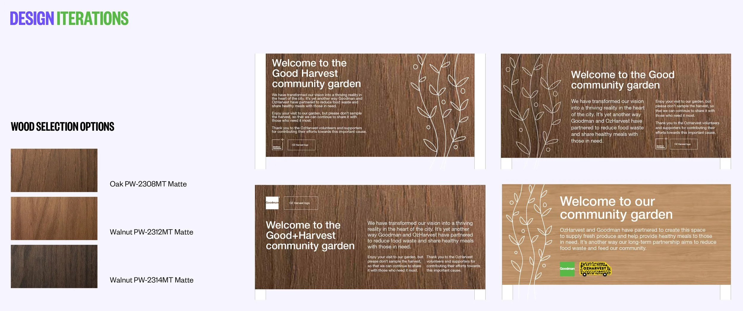
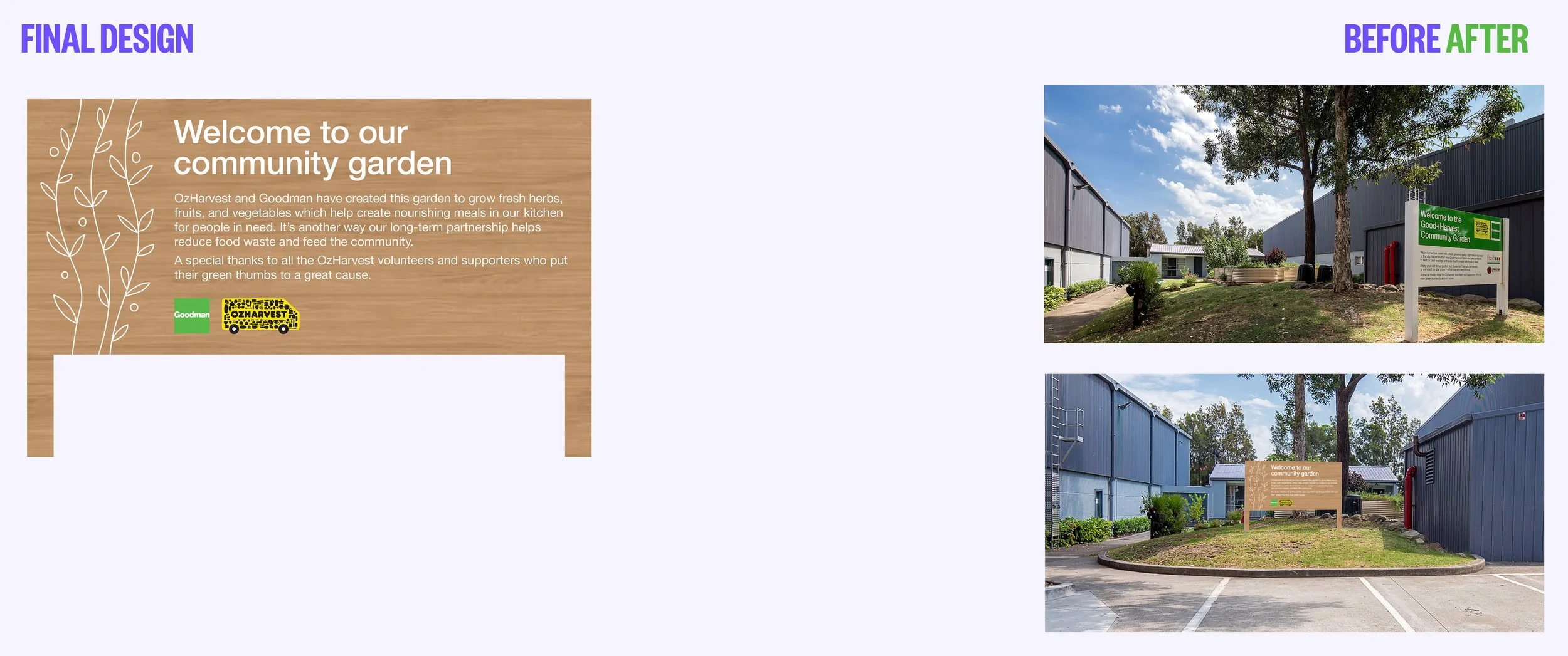
The following pages showcase the design process of updating signage at a Goodman estate where Oz Harvest have set up a community garden. The old signage needed a re-fresh, however trying to be as sustainable as possible, the exisiting sign was covered by the new design.

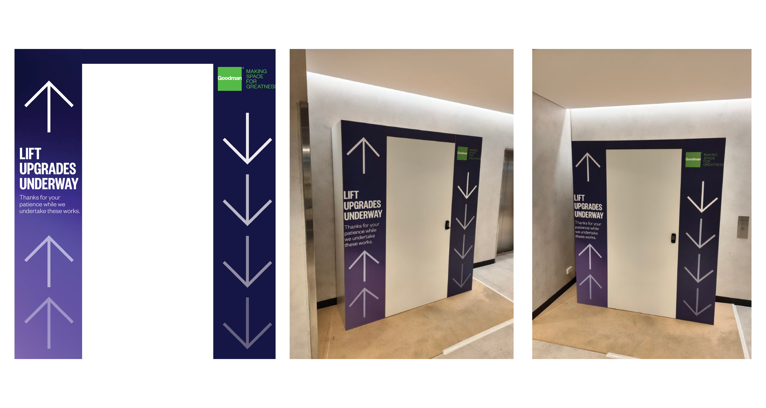
Hoarding designed to cover the outside of the lifts while they were out of order. The use of gradients, arrows and colour created a sense of movement, mimicking the movement of the lift. Text was placed at eye height and the Goodman logo was placed neatly in the top right corner. This attention to detail is how Goodman ensure their properties remain in a high calibre within the market.
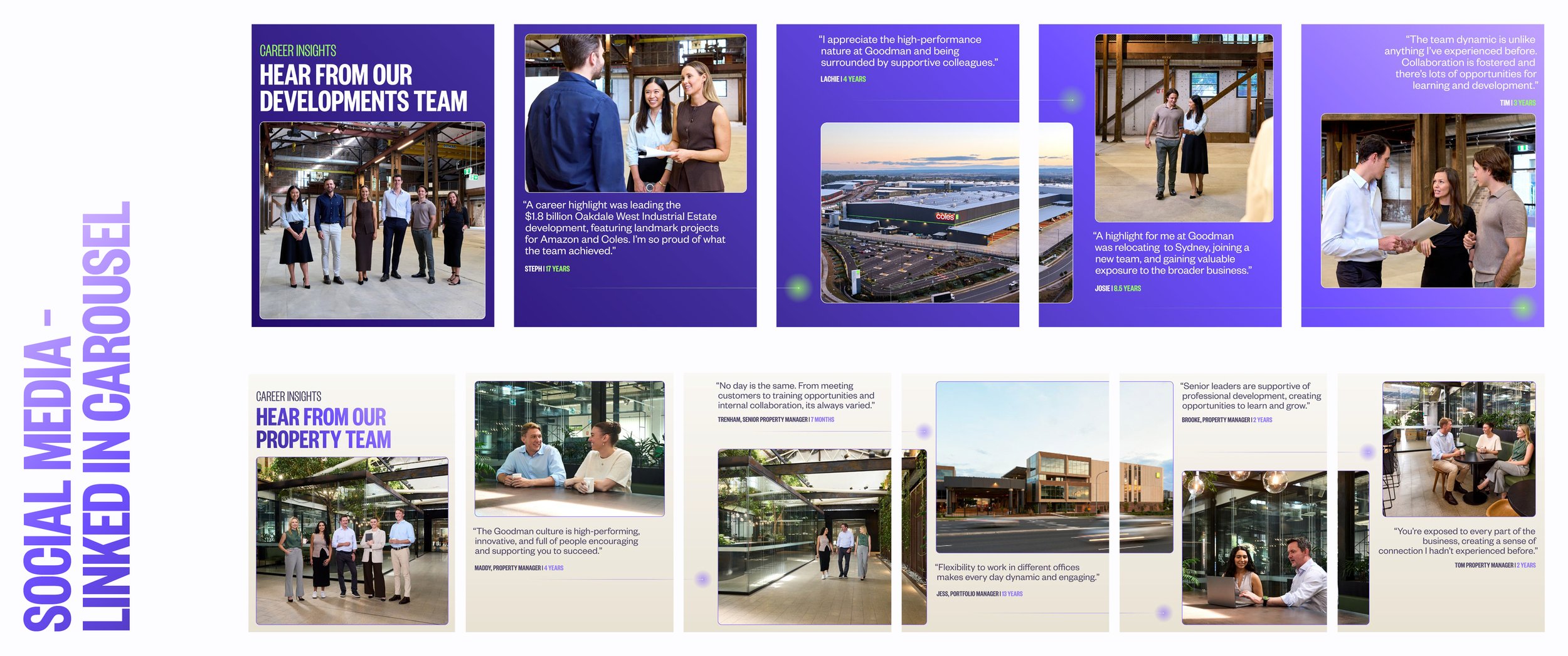
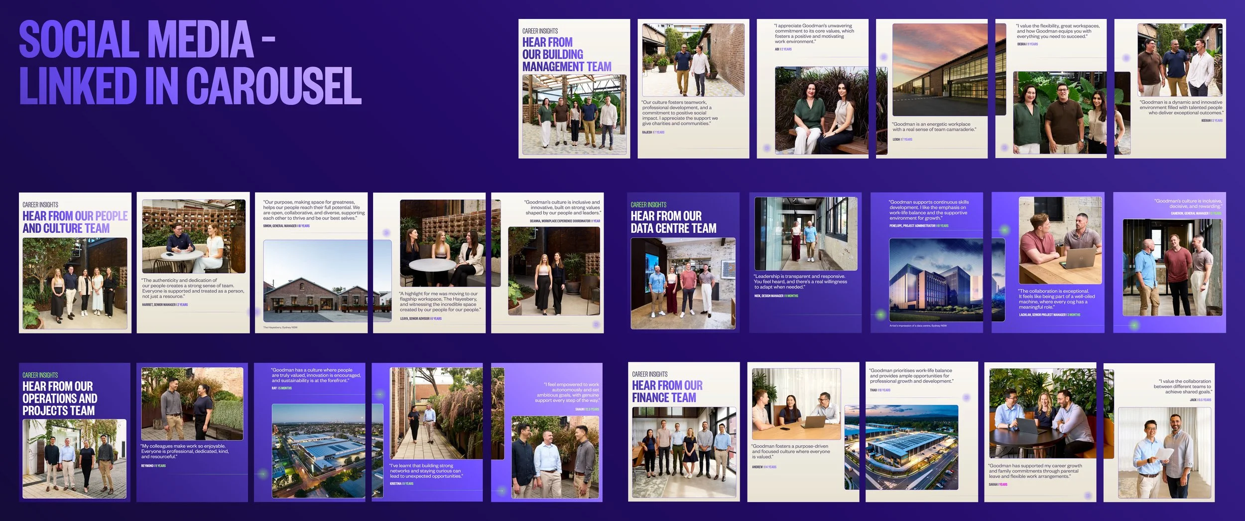
I designed a series of LinkedIn posts along side the Goodman marketing team. The brief was to portray the company's culture so the posts aimed to be friendly, professional while still using some of the newest brand elements like the gradients and the "ping."

I created a library of cover pages for designers to use, saving time on searching for and editing images. These covers were used on templated property brochure and property proposal documents.
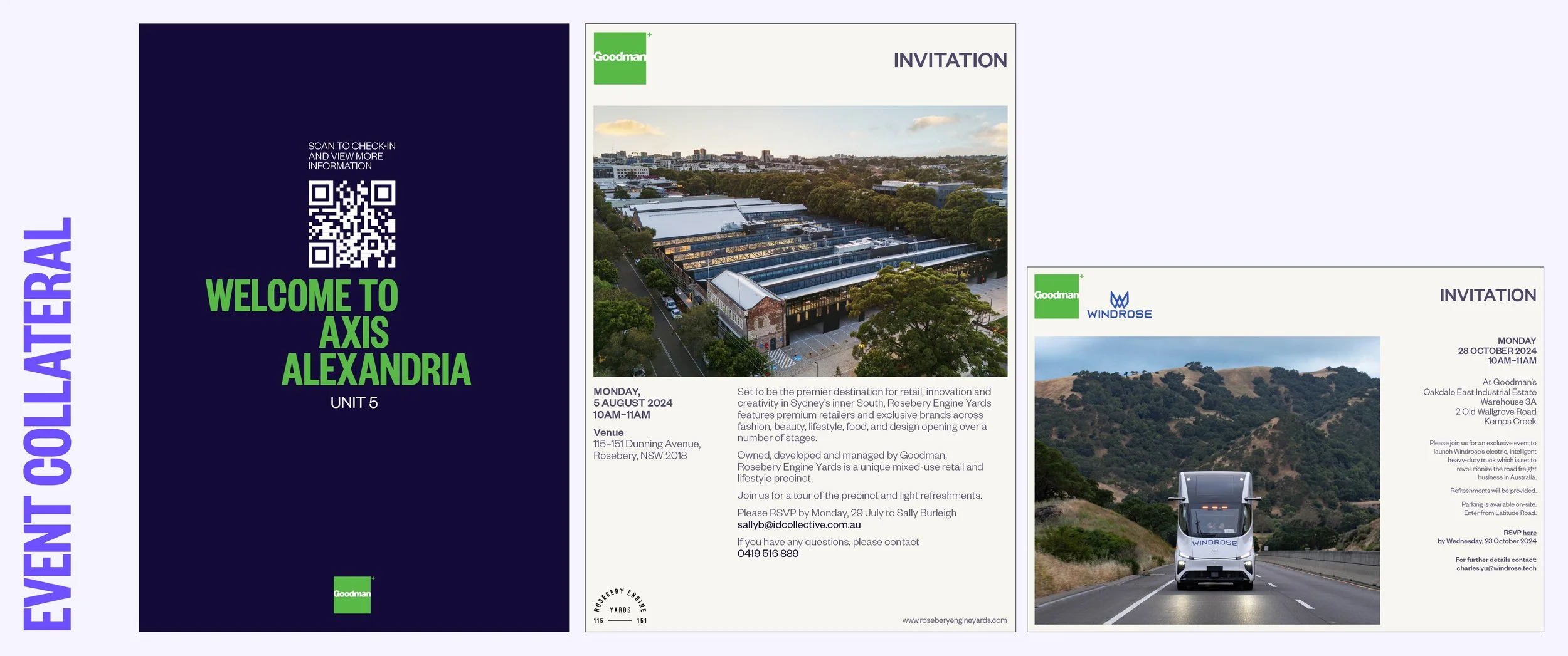
The above are some event collateral I designed for events held by the Goodman marketing team. The first is a QR code sign-in signage, followed by two invitations.
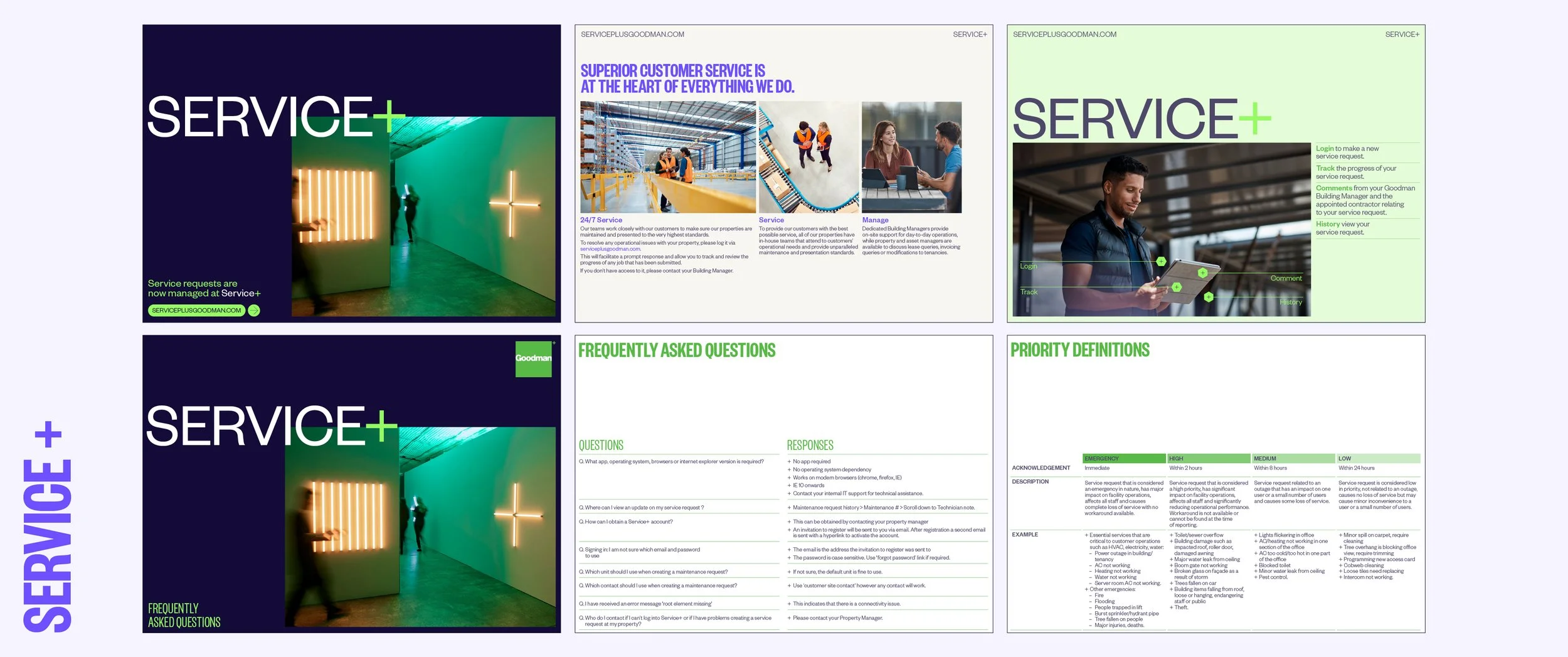
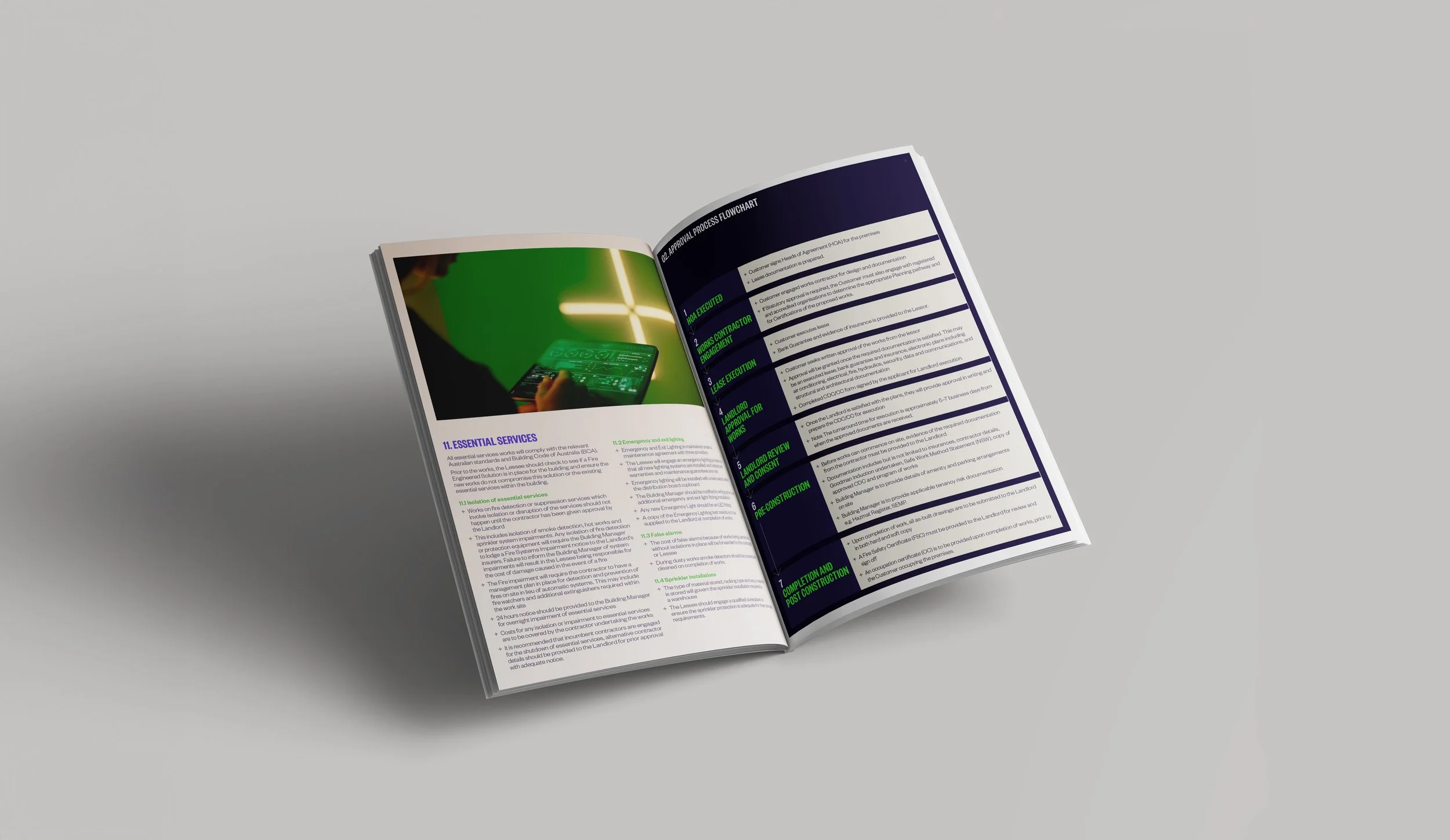
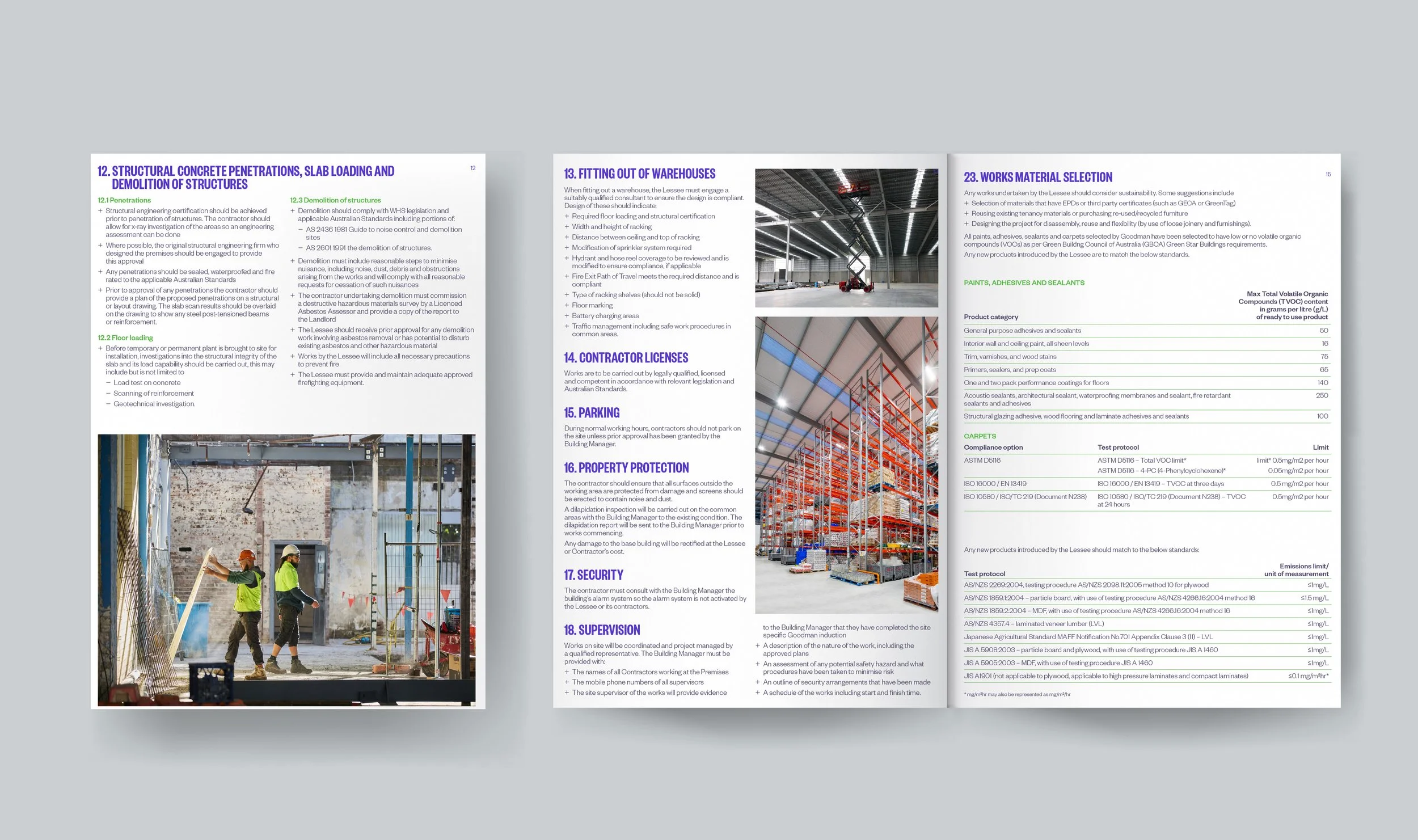
I refreshed the Service+ handbook using updated brand colours and new layouts aiming to create a simple, easy-to-use document.
These animations were displayed on the flagship office’s “totem” screens. The screens are used to display key events, updates on project developments and other internal marketing.
The brief for the National Reconciliation week animation requested Goodman branding, while the brief for the R U OK? Day animation was to use key colours and elements from the fundraiser’s brand colours.